Not A White Kitchen
If you were to poll a hundred people about elements of kitchen design, you’d likely find many popular answers…white cabinets, shaker door, marble countertops, subway tile, stainless appliances, open concept, so on and so forth.
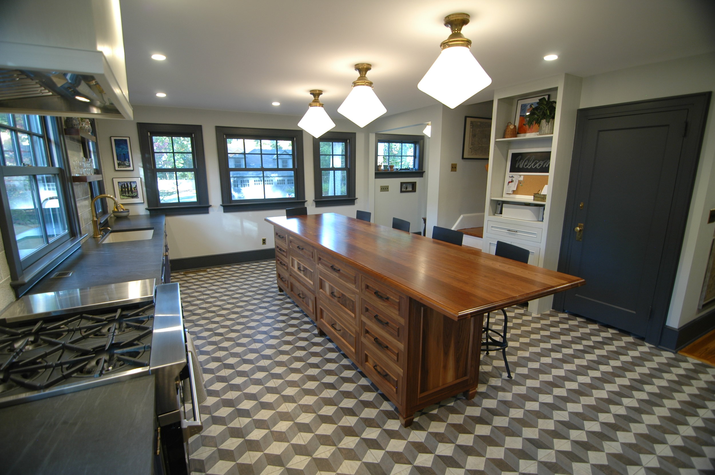
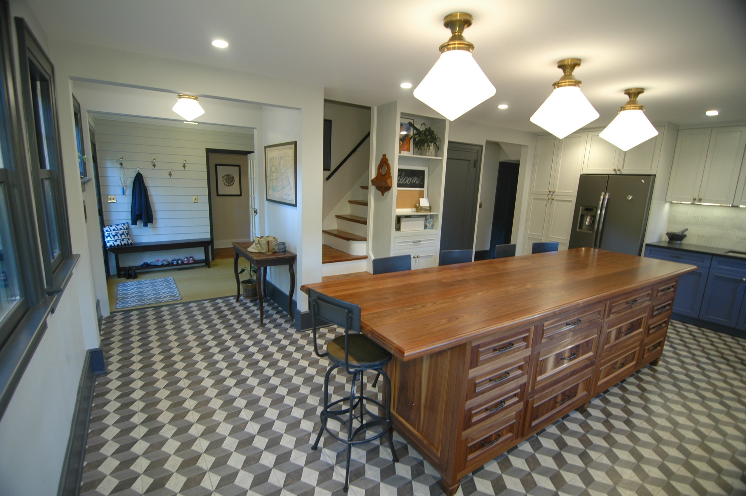
Truth be told, those keywords don’t and shouldn’t represent the status quo of what kitchens can be nowadays. This kitchen, designed in collaboration with Diana Weinstein of DW Studios, proves that a kitchen can be just as unique as the family that plans to occupy it.
Our client was very specific about their needs and wants. The wanted a BlueStar range, countertops and other finishes that didn’t need to be babied, a fridge that offered more in the way of storage space than a brand name, an island that resembled furniture more than stock cabinetry, and separate but connected “cook” and “clean” areas of the kitchen. They did not want stainless appliances, chrome or nickel finishes, white trim, standard wood plank flooring, or the kitchen to open up to the dining room.
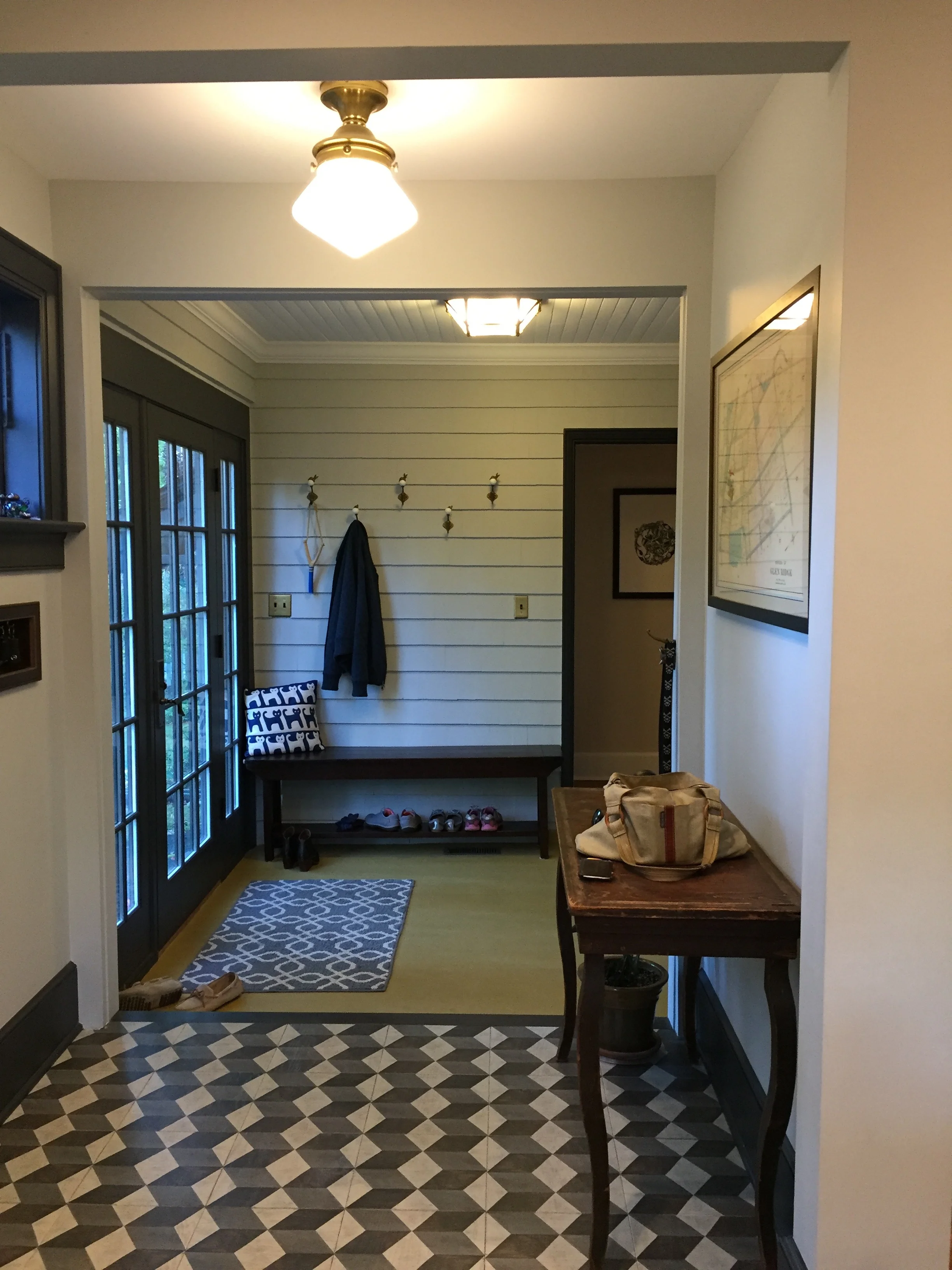
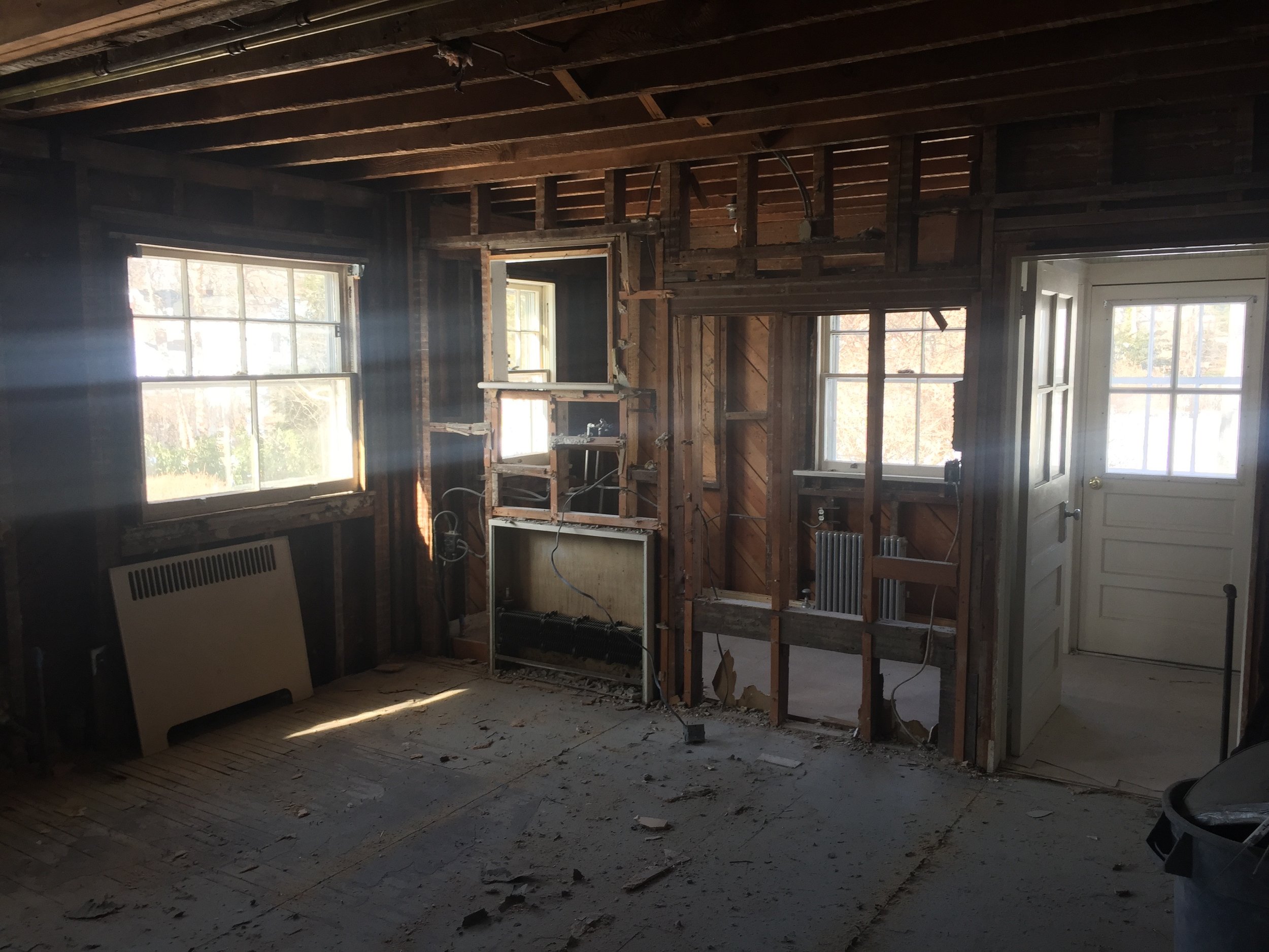
So after we gutted the long outdated kitchen that came with the house, including the 8 (yes, 8!) layers of flooring and subflooring, we went about designing a kitchen that responded to everything our Clients asked for. Wyanoke design, supplied, and installed custom painted and walnut cabinetry was provided by Plain & Fancy, soapstone and walnut countertops provided by Dente Trading and Grothouse, double hung windows by Marvin, and appliances by BlueStar, GE, and Miele. Diana Weinstein then added all the right finishes touches including the ceiling lights and sconces by Visual Comfort, antique brass faucets courtesy of Newport Brass, undermount sinks by Blanco, hand-painted WOOD floor tiles from Mirth Studio, and backsplash tile from Pratt & Larson.
There was more to this project than just the kitchen but you’ll just have to wait to see those photos.


